Carlo Scarpa: On (Good) Manners And Mannerism
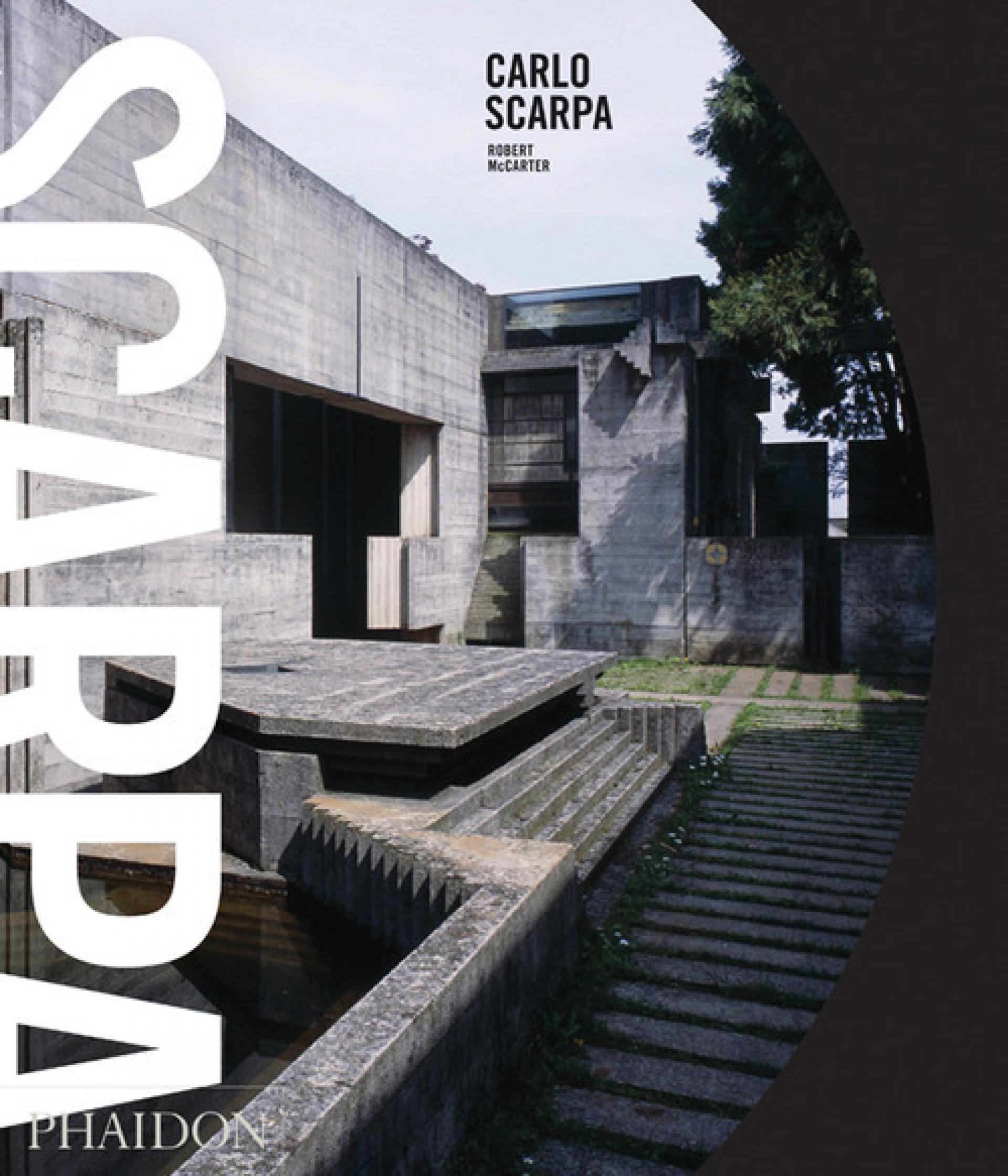
Carlo Scarpa. A monograph written by Robert McCarter, 2013.
There is a word we don’t usually associate with 20th century architecture: Mannerism. The term harks back to a painting style de rigueur in Europe four centuries ago. For us Mannerism evokes the feeling of ‘too much’, of not knowing when to stop. (When a detail needs to be refined to bring out the quality of the – yes – detail, the whole exercise is rapidly getting pointless.) Such an affliction can befall the painter, the architect or any other artist, especially the one too concerned with his own signature.
Most of 20th century’s architecture is not prone to mannerist detours: the materials are rough, space is often violently geometrical. Notwithstanding, we continue to judge buildings by their quality of detail and by the architect’s ability to know when to stop. This tradition, i.e. the appropriate attention to detail, is celebrated at the highest level by Carlo Scarpa whose architecture is aptly described as “determined not by the whole but by the part” in a new monograph published by Phaidon and reviewed in this very article.
In understanding Scarpa’s work, another great architect, Frank Lloyd Wright, plays a crucial part (We find a picture of the two men together on page 37). But Wright is not Scarpa’s only major influence: his eloquence in the combination of (rough) materials is also reminiscent of the great Louis I. Kahn. Unsurprisingly, the author, Robert McCarter, wrote extensively about both architects and this book can be seen as a logical consequence of these undertakings. It is another account of a classic architect with a classic vision of his profession. And as such it is an essential contribution to the re-discovery of a kind of architecture which recently has gone amiss.
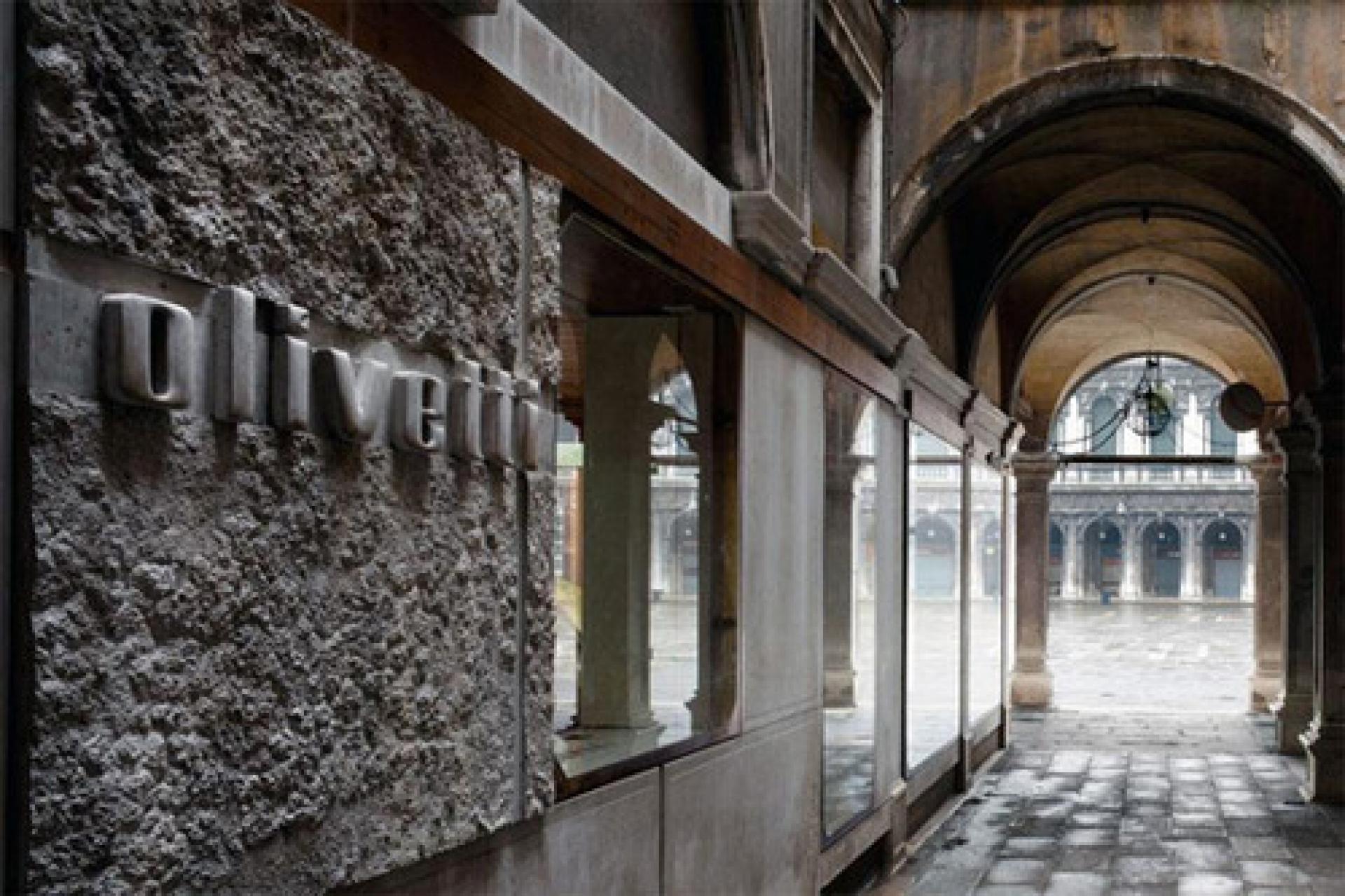
Detail and context: Olivetti Showroom,Venice (1957) via ArchDaily
Not many people speak about proportions and detailing today. Funky parametric forms and participatory structures seem to be much more exciting. Therefore it is a pleasure to open a monograph about an architect who blends his attention to detail with the ingenious integration of existing spatial environments. It is certainly a platitude to state that great architecture starts with observing the surroundings, but it holds true for Scarpa. Just look at his design of the Banca Popolare di Verona (1973-1978), a building well documented in the book.
In alternating thematic parts with chapters that focus on selected buildings, the author finds a way of unfolding Scarpa’s works in all its facets even if only few of his extraordinary glass designs (although here are many shapes which would make ultra-contemporary architects happy!) are discussed.
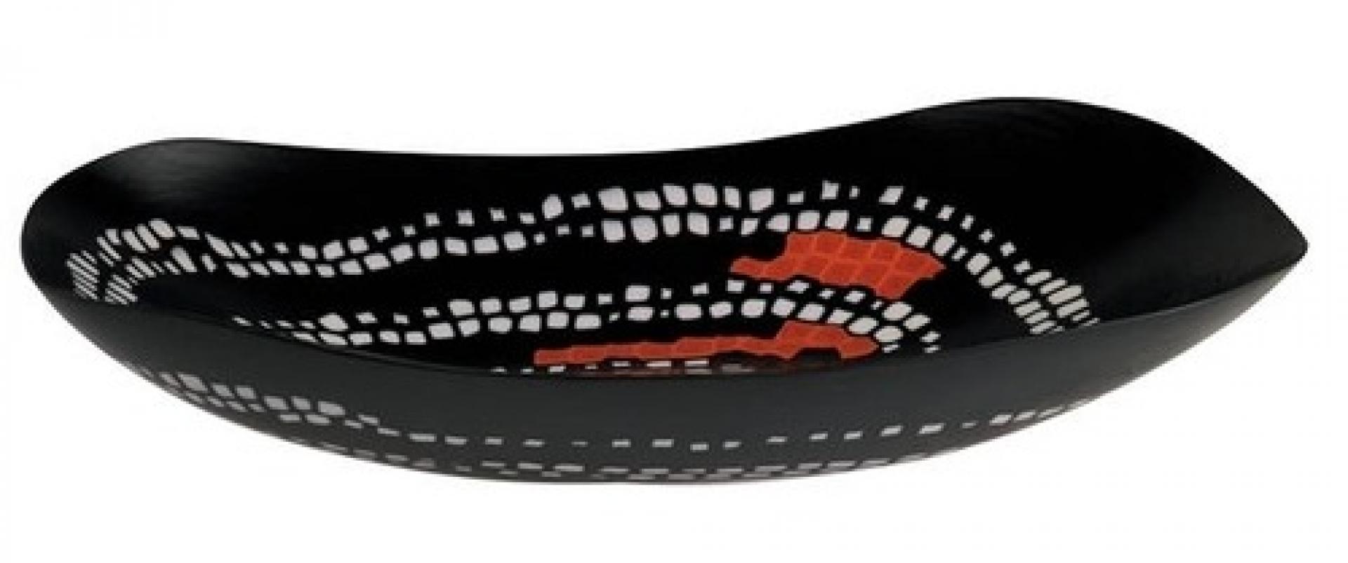
Serpente, a blown handmade and cut glass plate which Carlo Scarpa designed for the Murano glass manufacturer Venini in 1940.
The only thing upsetting is the book layout which has succumbed to the mannerism to which the architecture it presents remained immune. Who found it practical to change the size and font of words in a same paragraph? Architecture publications are made of text, photographs, drawings and archive material. These precious documents all come together on the computer screen of a graphic designer. Of course the designer strives to translate the architect’s style, ideas and obsessions into book form, but here obviously somebody did not know when to – stop.
- Thibaut de Ruyter
Carlo Scarpa By Robert McCarter. 288 pages, 175 colour and 175 black & white illustrations, hardback, 290 x 250 mm, 2013. Phaidon Press
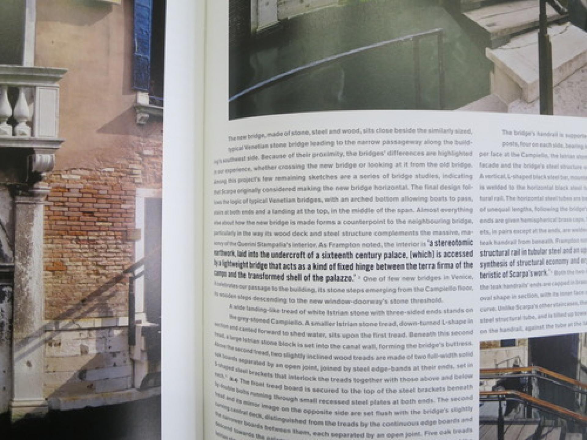
Book cover and excerpt below